January 26, 2018 by
CFP Review Ratings

This was originally posted on blogger here.
Introduction
We recently completed the bsides Nashville CFP. (Thank you all who submitted. Accepts and rejects will be out shortly.) We had 53 talks for roughly 15 slots so it was a tough job. I sympathize with the conferences that have in the 100's or 1,000's of submissions.
CFP Scoring
Our CFP tool provides the ability to rate talks from 1 to 5 on both content and applicability. However, I've never been happy with how it condenses this down to a single number across all ratings.
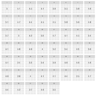
Our best guess is it simply averages all the values of both types together. Such ratings would look like this:
(We've removed the titles as this blog is not meant to reflect on any specific talk.)
This gives us _a_ number (the same way a physician friend of mine used to say ear-thermometers give you _a_ temperature) but is it a useful one?
First, let's use the mean instead of the median:
The nice thing about the median is it limits the effect of ratings that are way out of line. In many of our talks, one person dislikes it for some reason and gives it a substantially lower rating than everyone else. We see talks like 13 shoot up significantly. It also can cause drops such as talk 51.
Scoring with a little R
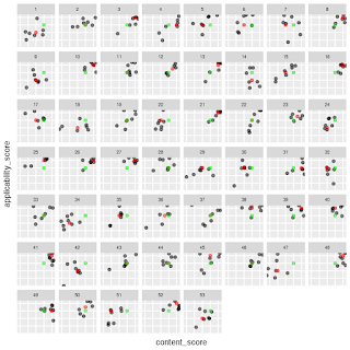
But what really would be helpful is to see _all_ the ratings:
Here we can see all of the ratings broken out. It's more complex but it gives us a better idea of what is actually happening for any one talk. The green dot is the median for all ratings combined. The red dots are the talks' median value. And the grey dots are individual ratings.
We can look at 13 and see it scored basically all 5's except for for one 4 in applicability, 1 'average' rating, and one below average rating bringing the median up to 5-5. When we look at 51, we see how it had a few slightly-below-average ratings and several below-average on content, and several below-average on both content and applicability. We also get to compare to the mean of all talks (which is actually 4-4) rather than assuming 3-3 is average for a talk.
One I find particularly interesting is 29. It scored average on applicability, but it's content score, which we would want to be consistently high, is spread from 1 to 4. Not a good sign. In the first figure, it scored a 3.2 (above average if we assume 3 is average since no average is shown). In the median figure, it is 3. But in this view we can see there are significant content concerns about this talk.
Conclusion
Ultimately, we used this chart to quickly identify the talks that were above or below the mean for both content and applicability. This let us focus our time on the talks that were near the middle and gave us additional information, in addition to the speaker's proposal and our comments, to make our decision on. If you'd like to look at the code for the figures, you can see the jupyter notebook HERE.
Future Work
In the future I could see boiling this down to a few basic scores: content_percentile, applicability_percentile, content_score range, and applicability_score range as a quick way to automate initial scoring. We could easily write heuristics indicating that we want content ratings to meet a certain threshold and be tightly grouped as well as set a minimum threshold for applicability. This would let us more quickly zero in on the talks we want, (and might help larger conferences as well).


