January 5, 2018 by
Visualizing Graph Data in 3D

This was originally posted on blogger here.
Introduction
One thing that's interested me for a while is how to visualize graphs. There are a lot of problems with it I'll go into below. Another is if there is a way to use 3D (and hopefully AR or VR) to improve visualization. My gut tells me 'yes', however there's a _lot_ of data telling me 'no'.
What's so hard about visualizing graphs?
Nice graphs look like this:
This one is nicely laid out and well labeled.
However, once you get over a few dozen nodes, say 60 or so, it gets a LOT harder to make them all look nice, even with manual layout. From there you go to large graphs:
In this case, you can't tell anything about the individual nodes and edges. Instead you need to be able to look at a graph laid out in a certain way algorithmically and understand it. (This one is actually a nice graph as the central cluster is highly interconnected but not too dense. I suspect most of the outlying clusters are hierarchical in nature leading to the heavily interconnected central cluster.)
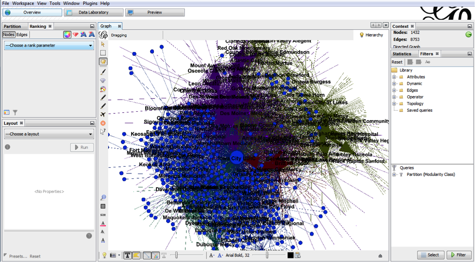
However, what most people want is to look at a graph of arbitrary size and understand things about the individual nodes. When you do that you get something like this:
Labels overlapping labels, clusters of nodes where relationships are hidden. Almost completely unusable. There are some highly interconnected graph structures that look like this no matter how much you try to lay them out nicely.
It is, ultimately, extremely hard to get what people want from graph visualizations. You can get it in special cases and with manual work per graph, but there is no general solution.
What's so hard about 3D data visualization?
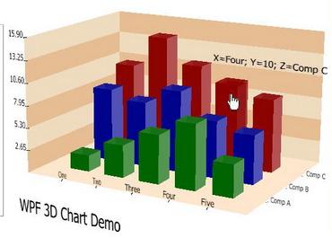
In theory, it seems like 3D should make visualization better. It adds an entire dimension of data! The reality is, however, we consume data in 2D. Even in the physical world, a stack of 3D bars would be mostly useless. The 3rd dimension tells us more about the shape of the first layer of objects in front of us. It does not tell us anything about the next layer. As such, visualizations like this are a 2D bar chart with clutter behind them:
Even when the data is not overlapping, placing the data in three dimensions is fundamentally difficult. In the following example, it's almost impossible to tell which points have what values on what axes:
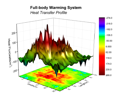
Granted, there are ways to help improve this, (mapping points to the bounding box planes, drawing lines directly down from the point to the x-y plane, etc), but in generally you would only do that if you _really_ needed that 3rd dimension (and didn't have a 4th). Otherwise you might as well use PCA or such to project into a 2D plot. Even a plot where the 3rd dimension provides some quick and easy insight, can practically be projected to a 2D heatmap:
Do you really need to visualize a graph?
Many times when people want to visualize a graph, what they really want is to visualize the data in the graph in the context of the edges. Commonly, graph data can be subsetted with some type of graph transversal (e.g. [[select ip == xxx.xxx.xxx.xxx]] -> [[follow all domains]] <- [[return all ips]]) and the data returned in a tabular format. This is usually the best approach if you are past a few dozen nodes. Even if long, this data can easily be interpreted as many types of figures (bar, line, point charts, heatmaps, etc). Seeing the juxtaposition between visualizing graphs because they were graphs, but when the data desired was really tabular heavily influenced how I approached the problem.
My Attempt
First, I'll preface this by saying this is probably a bad data visualization. I have few reasons to believe it's a good one. Also, it is extremely rough; nothing more than a proof of concept. Still, I think it may hold promise.
The visualization is a ring of tiles. Each tile can be considered to be a node. We'll assume each node has a key, a value, and a score. There's no reason there couldn't be more or less data per node, but the score is important. The score is "how relevant a given node is to a specified node in the graph. This data is canned, but in an actual implementation, you might search for a node representing a domain or actor. Each other node in the graph would then be scored by relevance to that initial node. If you would like ideas on how to do this, consider
my VERUM talk at bsidesLV 2015. For now we could say it was simply the shortest path distance.
One problem with graphs is node text. It tends to not fit on a node (which is normally drawn as a circle). In this implementation, the text scrolls across the node rectangle allowing quick identification of the information and detailed consumption of the data by watching the node for a few seconds. All without overlapping the other nodes in an illegible way.
Another problem is simply having two many nodes on screen at once time. This is solved by only having a few nodes clearly visible at any given time (say the front 3x3 grid). This leads to the question of how to access the rest of the data. The answer is simply by spinning the cylinder. The farther you get from node one (or key1 in the example), the less relevant the data. In this way, the most relevant data is also presented first.
You might be asking how much data this can provide. A quick look says there are only 12 columns in the cylinder resulting in 36 nodes, less than even the 60 we discussed above. Here we use a little trick. As nodes cross the centerline on the back side, they are actually replaced. This is kind of like a dry-cleaning shop where you can see the front of the clothing rack, but it in fact extends way back into the store. In this case, the rack extends as long as we need it to, always populated in both directions.
I highly recommend you try out the interactive demo above. it is not pretty. The data is a static json file, however that is just for simplicity.
Future Work
Obviously there's many things that can be done to improve it:
A search box can be added to the UI and a full back end API to populate the visualization from a graph.
Color can be added to identify something about the nodes such as their score relative to the search node or topic.
The spacing of the plane objects and camera can be adjusted.
Multiple cylinders could exist in a single space at the same time representing different searches.
The nodes could be interactive.
The visualizations could be located in VR or AR.
- Nodes could be selected from a visualization and the sub-graph returned in a more manageable size (see the 60ish node limit above). These subgraphs could be stored as artifacts to come back to later.
- The camera could be within the cylinder rather than outside of it.
Conclusion
I'll end the same way I began. I have no reason to believe this is good. It is, at least, an attempt to address issues in graph visualization. I look forward to improving on it in the future.
brom stromen said on 2018-11-05
There are certainly a lot of details like that to take into consideration. That is a great point to bring up. I offer the thoughts above as general inspiration but clearly there are questions like the one you bring up where the most important thing will be working in honest good faith. I don?t know if best practices have emerged around things like that, but I am sure that your job is clearly identified as a fair game. Both boys and girls feel the impact of just a moment?s pleasure, for the rest of their lives.https://dashcambox.com/
Richard H. Black said on 2019-01-20
Awesome article, it was exceptionally helpful! I simply began in this and I’m becoming more acquainted with it better! Cheers, keep doing awesome! color night vision security camera
play said on 2019-05-09
We are really grateful for your blog post. You will find a lot of approaches after visiting your post. I was exactly searching for. Thanks for such post and please keep it up. Great work. 바둑이사이트
Faiza Jee said on 2019-08-17
This is such a great resource that you are providing and you give it away for free. I love seeing blog that understand the value of providing a quality resource for free. Access Control Systems
Mia said on 2019-12-06
What we are simply starting to see on the Web is a design approach that owes as a lot to science as to workmanship. race car modeling
yoyoservice said on 2020-02-16
I and my partners have totally taken pleasure in this blog.portrait canvas prints
Johnson said on 2020-07-07
In a render vision all the more engaging structure at that point gives you an edge over old mediums.
for ict 99 said on 2020-08-09
Great Article Artificial Intelligence Projects Project Center in Chennai JavaScript Training in Chennai JavaScript Training in Chennai
logan pual said on 2021-05-23
Minecraft can be played on the web and disconnected, the game reenacts both the day-time and evening time, during the evening mode beasts show up, so ensure you have the security of a fort worked to guarantee you stay ensured! With well more than 2 million individuals having now purchased a Minecraft account, it’s plainly an extraordinary game! Minecraft Servers
Asad shah said on 2022-02-27
building design I would like to say that this blog really convinced me to do it! Thanks, very good post.